Defined the first-ever UI Kit and Foundation library for MyInvestor
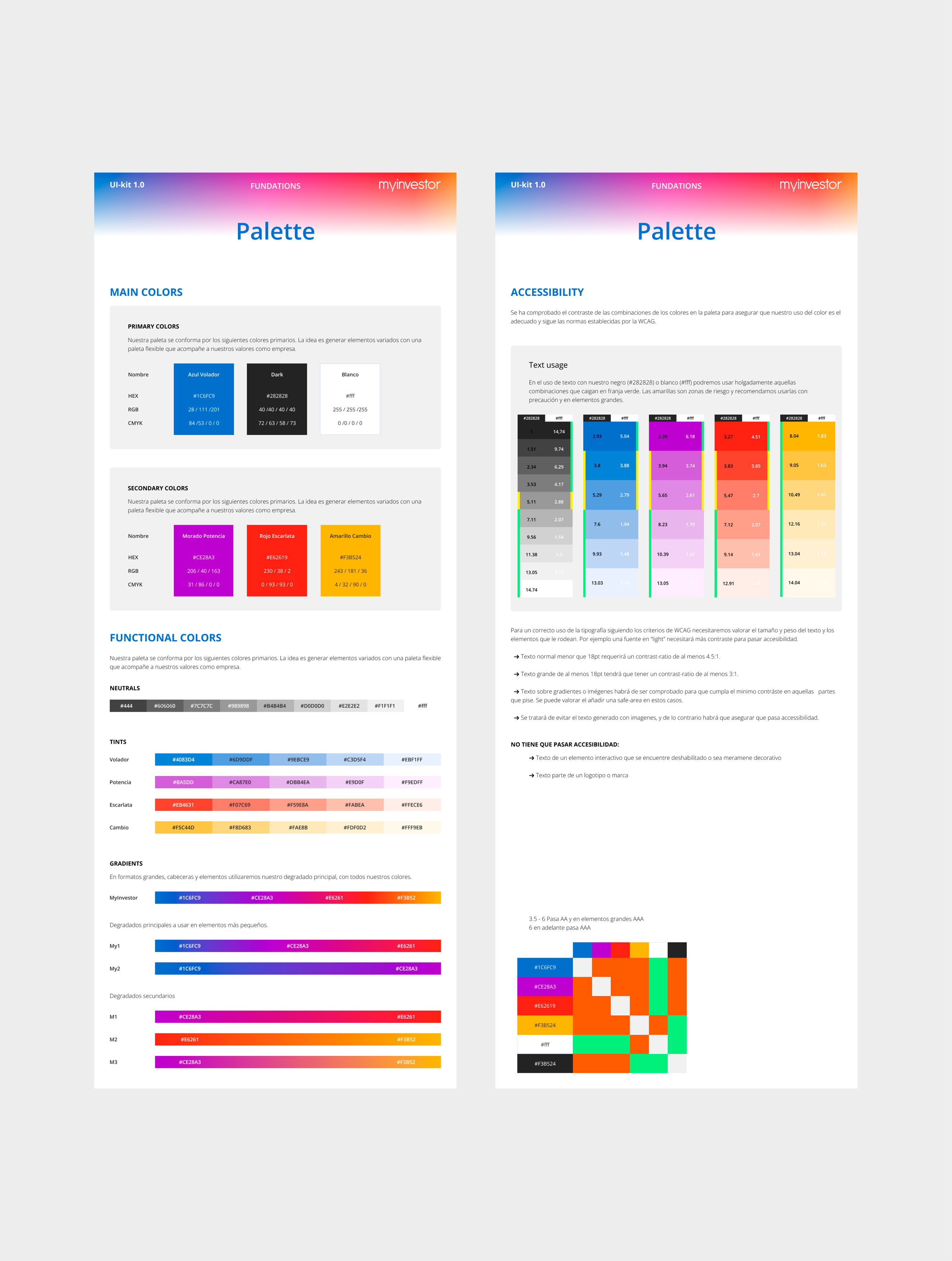
Audited and overhauled brand colors to meet WCAG standards for digital banking
Replaced manual, ad-hoc workflows with a scalable component structure
Project
overview
Background
I joined MyInvestor during a major rebranding phase. The company lacked a centralized design source: there were no UI kits, no documentation, and no accessibility standards. Design-to-Dev handoff was manual and inconsistent.
The Goal
Build the "Minimum Viable System" (MVS) to unblock the team and ensure the new brand was digitally scalable.
Building the Bedrock
Execution
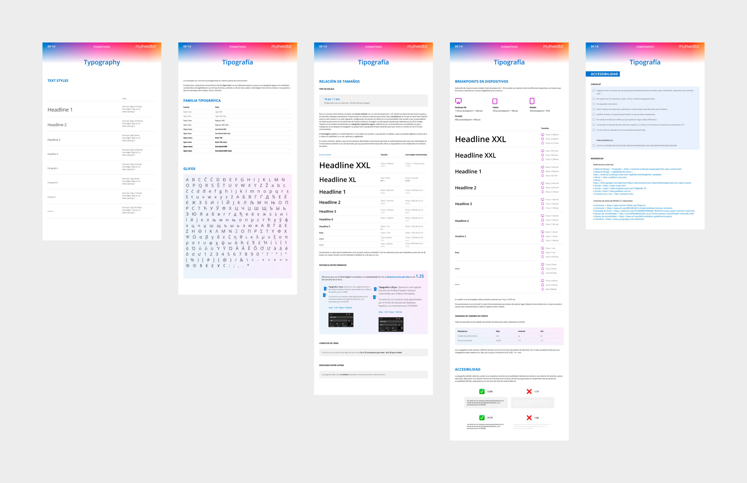
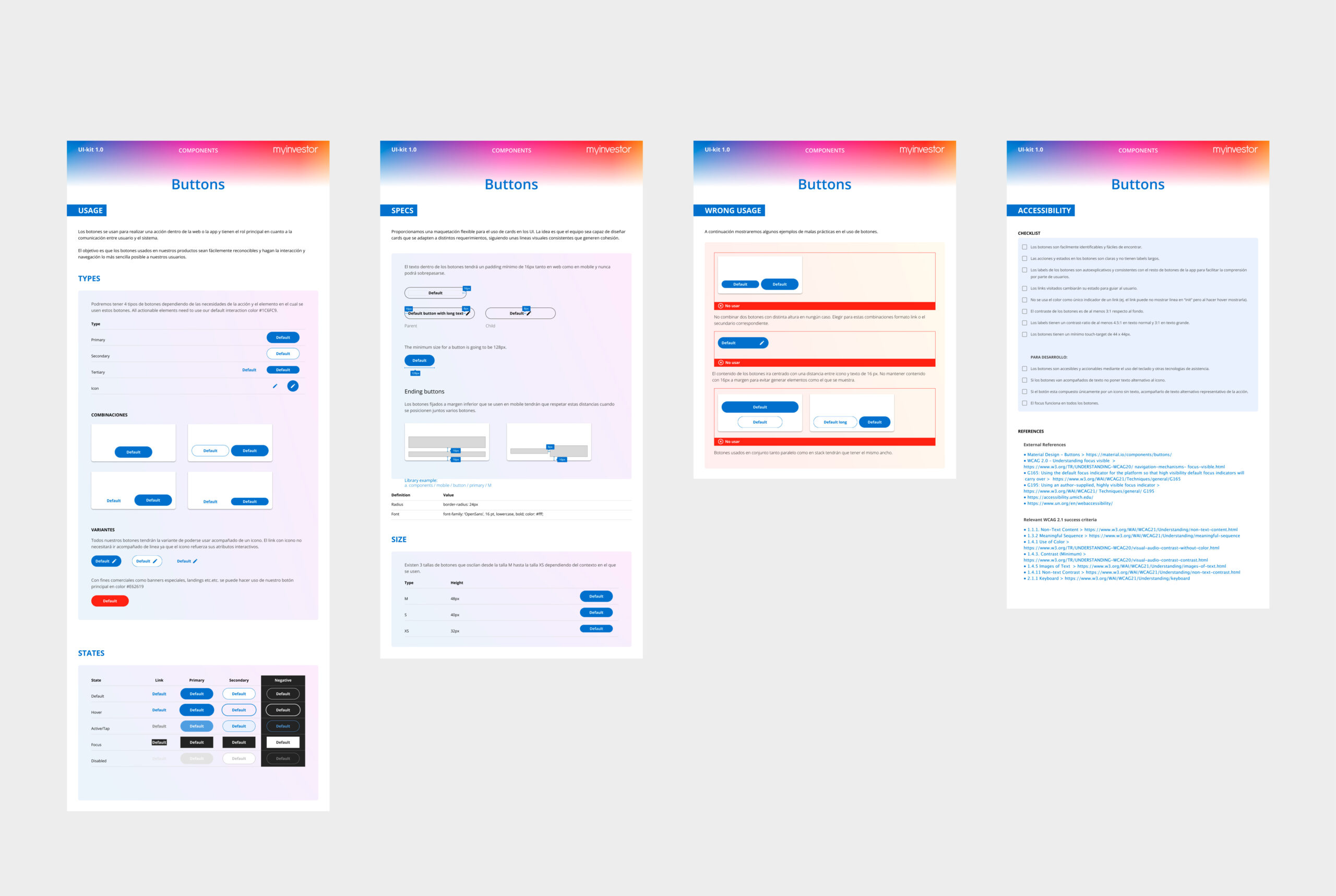
Foundation & Accessibility
I translated static brand guidelines into a functional digital system. This included a semantic color palette with strict accessibility rules and a typography scale optimized for complex financial data.
Component Architecture
I designed a "Documentation-First" component structure. Each asset included usage guidelines, "Do’s and Don’ts," and accessibility checks, moving the team away from guesswork and toward a shared language.
Bridging the Silos
At the time, Design and Engineering operated in silos. I initiated a collaborative governance model, including developers in the component-building process to ensure technical feasibility from day one.
Documentation consisted of accessibility checks for design/devs, specifications of architecure and usage as well as behaviour.
The Result
What was previously a manual, fragmented process became a documented, scalable library. I left the team with a "Ready-to-Scale" framework that reduced design debt and established the first bridge between brand, product, and engineering.